The Quarterly Statement Q1 2023: A Bull Market, a Banking Crisis and Bond Volatility
Market Review: First Quarter 2023
What We Know: 1Q 2023 Recap
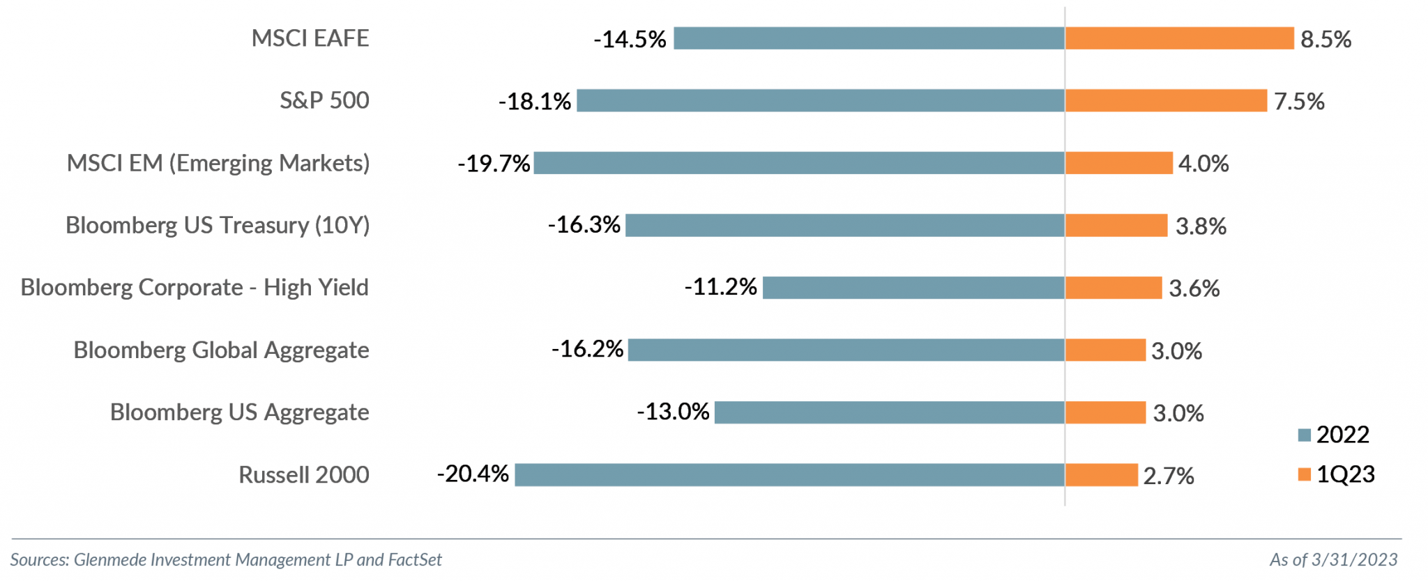
Equity markets rallied in Q1 2023, with much of what underperformed in 2022 (i.e., mega cap, cryptocurrency and anything risk-on) reversing course to rebound sharply to start the year. The Nasdaq 100 rallied over 23% from its low on December 28, 2022, and a 32.4% decline in CY 2022. The tech-heavy index had its best January since the dot-com days in 2001 with a 10.6% return. The S&P 500 returned 7.5% for its first back-to-back positive quarters since Q4 2021. The rally focused on the mega cap stocks,1 which combined accounted for almost 75% of the S&P 500 jump. The mega cap stock performance helped drive large cap growth, which realized its biggest quarterly outperformance over large cap value since the COVID rally in Q2 2020, with the Russell 1000 Value Index returning 1.0% and the Russell 1000 Growth Index returning 14.4%.
Mega cap stocks pushed the Information Technology sector to lead the S&P 500 with a 21.5% return, its strongest since Q2 2020, followed by Communication Services, 20.5%, and Consumer Discretionary, 16.8%. Financials was the worst performing sector with a 5.6% decline — not surprising given the banking crisis following the collapse of Silicon Valley Bank and Signature Bank in the quarter.
Small cap (Russell 2000 Index) returned 2.7% for the quarter but trailed its large cap counterparts. Small cap value (Russell 2000 Value Index) underperformed growth (Russell 2000 Growth Index) -0.7% versus 6.1%. Like large cap, this small cap growth outperformance was the largest since Q2 2020.
International markets started the year strong as well. Developed international (MSCI EAFE Index) returned 8.7%, and international emerging markets (MSCI Emerging Markets Index), 4.0%.
Equity markets continued to realize above average volatility, with the Cboe Volatility Index (VIX) averaging 20.7 this quarter compared to the average since 1990 of 19.7. The notable volatility, however, was in the bond market. The ICE BofA MOVE Index (MOVE), which is a proxy for U.S. Treasury volatility, hit levels not seen since the global financial crisis. The volatility measure peaked at 198.7 and averaged 126.4; the average over the past 33 years was 92.1. While the volatility levels had been elevated relative to the longer-term averages at the start of the quarter, the measure spiked during the week following the collapse of Silicon Valley Bank and Signature Bank amidst uncertainty as to how much contagion the system could endure. The U.S. Treasury 2Y yield had daily basis-point swings not seen since the early 1980s. While this period also had inflationary pressures, the U.S. Treasury 2Y yields were in the 10%-14% range, notably above this quarter’s high of just under 5.1%. The spread of the U.S. Treasury 10Y-2Y yields, a much-watched recessionary indicator, peaked at -1.07, the most since 1981, before collapsing following the banking crisis to end the quarter at -0.56. With the rate-rally, the majority of fixed income strategies had positive returns this quarter, including Treasury, corporate and municipal bond strategies.
What We Debate:
A Practitioner’s Perspective – Opinions with Capital at Risk

While there are many variables relevant to an investment thesis, we believe the information in market pricing can be additive to the investment mosaic. The market is a dynamic place where investors express opinions with capital. Compare that to an opinion poll in which respondents simply answer questions, with no capital involved and little at risk. As an example, had we taken a poll on March 13 following the collapse of both Silicon Valley Bank and Signature Bank and asked some investors if the Federal Reserve should hike rates again, the opinions likely would have varied, with some very strong. However, when the Fed raised rates 25 basis points at its March meeting following a volatile week for the banking sector, the likely outcome would have been some people boasting that their opinions were consistent with the Fed’s actions and others complaining. No harm, no foul, to those who had taken the poll.
Conversely, had we asked these same investors if they wanted to risk money on whether the Fed would raise rates, the outcomes likely would have changed from bragging rights to actual transfers of capital with potential life-changing implications. Once capital is at stake, an opinion has financial consequences, and confidence around those opinions should increase. We are not pretending to be an innovator of this thought process (and acknowledge that Annie Duke’s book Thinking in Bets: Making Smarter Decisions When You Don’t Have All the Facts does an excellent job explaining this concept), but merely trying to put context around why we believe understanding the market pricing and implied probabilities of future events has value to an investment thesis. Market implied probabilities are opinions with capital at risk. While many of these events may be a shorter-term versus a longer-term investment horizon, they can be helpful pieces in the investment mosaic. They allow us to challenge our assumptions.
In our view, the Fed’s rate decisions constitute one of the most impactful uncertainties to future market pricing. While we believe the length of time at the terminal rate will have more effect on financing costs and risk assets than the terminal rate being within 50 basis points of the Fed’s 5%-5.25% dot plot expectation, the range of opinions on how the central bank will respond over the next eight months and ultimately its actions will likely be key drivers of market volatility and performance (read our March 1 Market Snapshot: To DIS or Not to DIS, That Is INFLATION for more details). To gauge market expectations versus Fed rhetoric, we chart the Fed funds futures implied rate for each month versus the Fed’s dot plot for year-end, as shown in Exhibit 1.
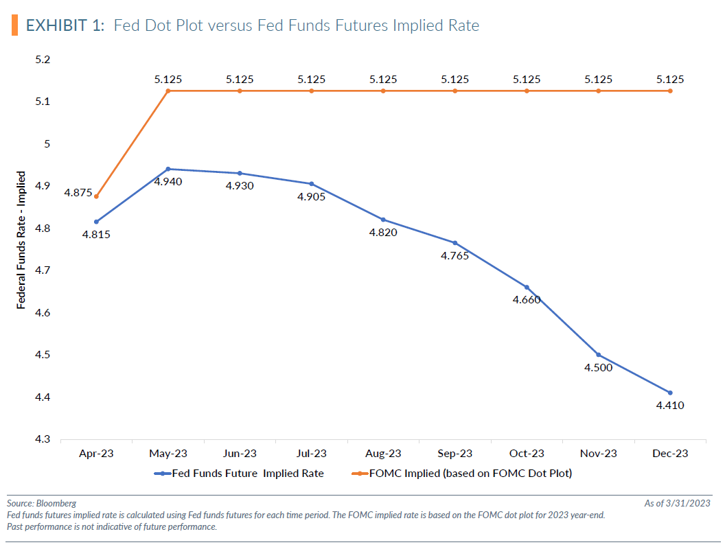
The Fed’s dot plot trajectory is notably different than the market’s implied expectations through year-end. The market is implying the Fed will cut rates this year, and the Fed is indicating via its dot plot that it will not. For context, based on the latest Wall Street Journal Economic Forecasting Survey, 39% of economists expect the Fed to cut rates by year-end.2 Our debates do not focus on what path is likely to be correct, but rather on what drives the differences between these expectations because uncertainty and divergence from market expectations can create market volatility.
The Fed has been steadfast in stating that taming inflation is a priority. While recent data suggests the U.S. economy may be past peak inflation, current inflation levels of 5% are more than double the Fed’s target of 2%. The Fed has also been adamant about the need to balance fighting inflation without sending the U.S. economy into a recession. While not the only possible reasons the Fed may cut, for simplicity’s sake we assume that the market is pricing in either 1) inflation recedes to the Fed’s target rate of 2% or 2) the U.S. economy enters a recession. Again, for context, the Wall Street Journal Economic Forecasting Survey suggests economists see a 61% probability of the U.S. entering a recession in the next 12 months, the same probability as the start of the year.3
Exhibit 2 charts the rolling 3-year correlation of the spread between the Russell 1000 Growth and Value indices versus the Barclays 10Y U.S. Treasury yield. While growth stocks behaved like bond proxies over the past decade of easy monetary policy, the correlation reached levels this quarter similar to those of the savings and loan crisis in 1991. While we admit that correlation does not imply causation, we debate the causation of the recent rally of risk assets during shifts in market implied rate cuts.
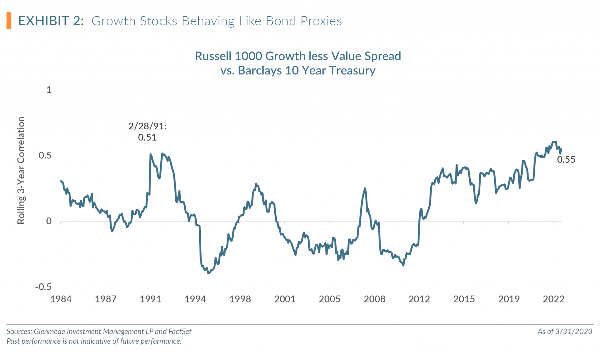
If market expectations of Fed cuts were driven by recession fears, the shift to risk assets seems inconsistent with those expectations. If the shift is not driven by a concern of increasing recession risks, could it be a rally based on inflation declining and the Fed halting rate cuts? Could the expectation of the Fed being able to bring inflation down to levels closer to the target, even if not 2%, be enough for investors to feel comfortable adding risk to portfolios?
We are not trying to provide a Rosetta stone to interpreting why the market’s implied rate curve is different than the Fed’s, but do believe investors are pricing in a lower probability of a recession than economists. We also believe liquidity shifts in fixed income markets with the unprecedented increase in rates over the past year is a driving factor for the market’s implied curve. However, we recognized there are too many variables, and the complexity of markets does not allow a simple answer. We use this as an example of why we believe there is value in recognizing expectations in a market pricing, particularly when they are incongruent with other data points. Understanding the market implied probabilities allows for challenging assumptions, better managing risk and considering opportunities within portfolios. Our debates will not always lead to investment shifts, but we believe that for every day we challenge our assumptions, we will be better investors because of it.
Top 5 Quarterly Charts
Our Quantitative investment team produces a plethora of charts throughout the quarter. Here are what we believe are the top five most interesting charts for this quarter.
Observations:
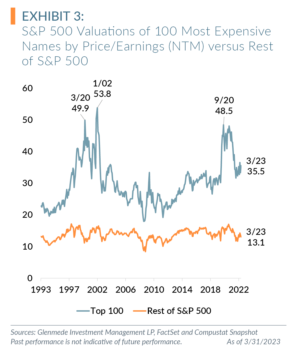
- The 100 most expensive names trade at a 172%premium to the rest of the S&P 500 compared to a longer-term median since 1993 of 107%.
- The 100 most expensive names are currently ranked in the 82nd percentile and 23% premium to the median since 1993 versus the rest of the index at the 33rd percentile and a 6% discount to the median since 1993.
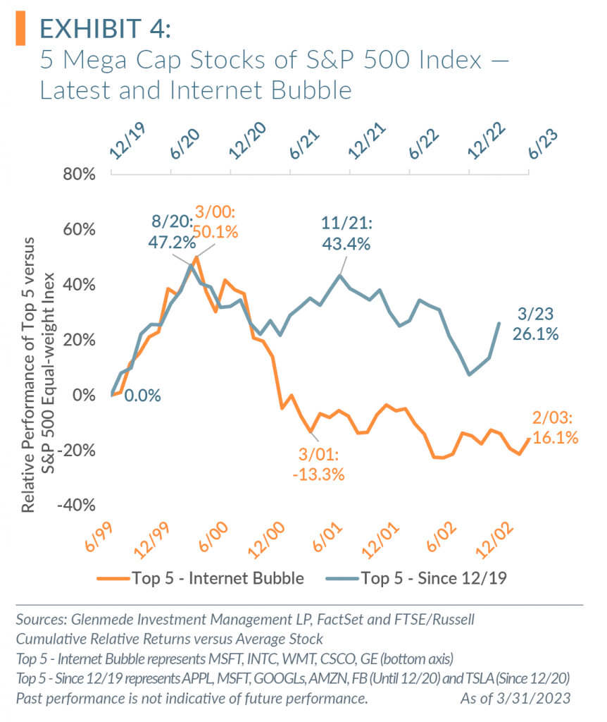
Observations:
- The period of the Internet bubble in 2000 and the post-COVID rally of mega cap growth stocks both saw the top five weightings of the S&P 500 notably outperform the average stock of the index over several months.
- The reversal of the price outperformance following the Internet bubble took roughly a year. While the five mega cap stocks of the post-COVID rally have given back some of the outperformance, there remains a level of outperformance that we expect to revert.
Observations:
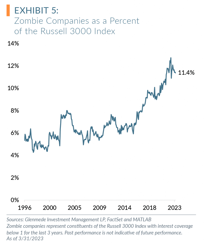
- The excess monetary policies over the past decade have contributed to the increase in zombie companies — those with interest coverage below 1 for the last 3 years — as a percentage of Russell 3000 constituents.
- The end of this “easy money” period will likely negatively impact unprofitable, leveraged companies, characteristics of zombie companies.
Observations:
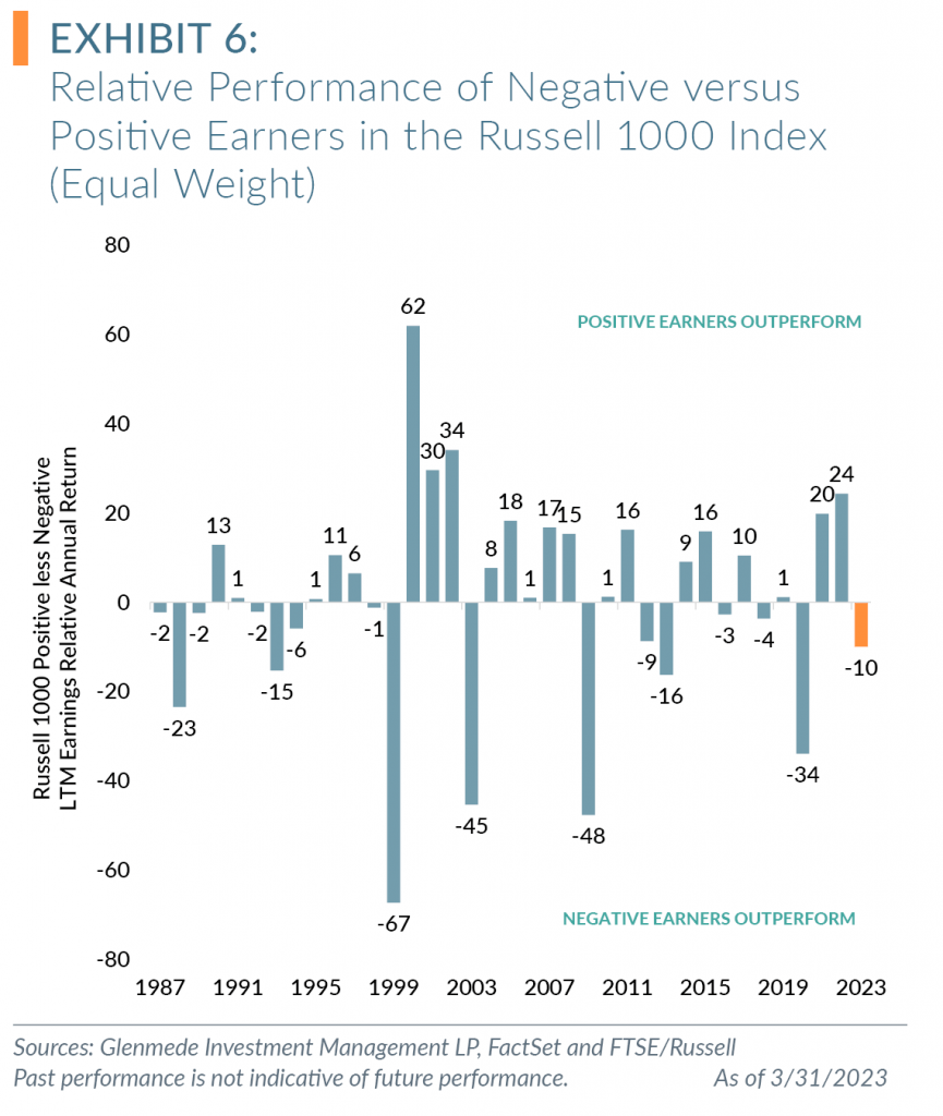
- Over the past 35 years, investing in companies with positive earnings has been a successful strategy versus investing in companies with negative earnings, even as the Russell 1000 Index has had cyclical periods of negative earners outperforming positive earners. We define a negative earner as any company without earnings over the trailing 12 months.
- Since 1987, positive earners have outperformed negative earners by 4.8% annualized (11.9% annualized return for positive earners vs. 7.1% annualized return for negative earners).
- While Q1 2023 saw a reversion of performance in favor of negative earners, we continue to prefer investing in positive earners for a long-term investor.
Observations:
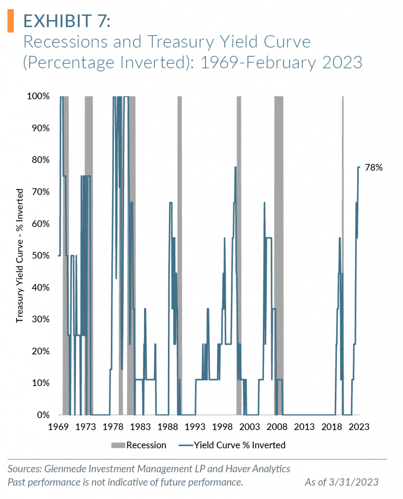
- Historically, recessions followed when over 50% of the Treasury yield curve was inverted.
- As of Q1 2023, 78% of the yield curve was inverted.
1 Mega cap stocks include Apple Inc., Microsoft Corp., Alphabet Inc. CL A & C, Amazon.com Inc., NVIDIA Corporation and Tesla, Inc.
2 Torry, H., and A. DeBarros. “Economists in WSJ Survey Still See Recession This Year Despite Easing Inflation.” The Wall Street Journal, January 15, 2023. https://www.wsj.com/articles/despite-easing-price-pressures-economists-in-wsj-survey-still-see-recession-this-year-11673723571.
3 Ibid.
All data is as of 3/31/2023 unless otherwise noted. Opinions represent those of Glenmede Investment Management LP (GIM) as of the date of this report and are for general informational purposes only. This document is intended for sophisticated, institutional investors only and is not intended to predict or guarantee the future performance of any individual security, market sector or the markets generally. GIM’s opinions may change at any time without notice to you.
Any opinions, expectations or projections expressed herein are based on information available at the time of publication and may change thereafter, and actual future developments or outcomes (including performance) may differ materially from any opinions, expectations or projections expressed herein due to various risks and uncertainties. Information obtained from third parties, including any source identified herein, is assumed to be reliable, but accuracy cannot be assured. This paper represents the view of its authors as of the date it was produced, and may change without notice. There can be no assurance that the same factors would result in the same decisions being made in the future. In addition, the views are not intended as a recommendation of any security, sector or product. Returns reported represent past performance and are not indicative of future results. Actual performance may be lower or higher than the performance set forth above.